
Every year, the Pantone Color Institute announces a colour of the year that is meant to represent the mood for the upcoming year. Late last month, the institute announced two shades, ‘Ultimate Grey’ and ‘Illuminating’ as the Pantone Color of the Year 2021. The union of the two independent colours, they said, expressed a mood of strength and positivity.
“As people look for ways to fortify themselves with energy, clarity, and hope to overcome the continuing uncertainty, spirited and emboldening shades satisfy our quest for vitality,” read the post.
Metrolife spoke to experts from the field of fashion, interior design and advertising to find out how the trend will take form in India.
Interior design
Shalini Chandrashekar and GS Mahaboob Basha, co-founders, Taliesyn - Design & Architecture, says that grey symbolises a solid, neutral and subtle demeanour, while yellow is emblematic of all things sunny, cheerful and vibrant.
“A certain sense of visual dynamism is put into action when these hues come together, and their combination is a symbolic harbinger of upliftment,” Shalini says.
Asha Sairam, principal designer, Studio Lotus and says with its sombre and muted expression, grey serves as the ideal ground, while yellow can be used to add bright pops of colour in furniture upholstery, throw pillows and cushions, or even a work of art.
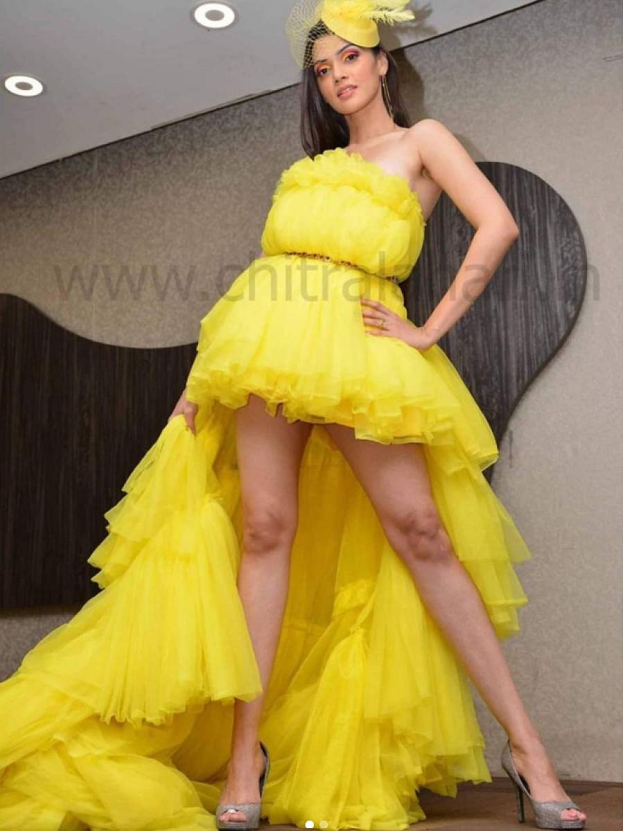
“Overusing yellow, especially the brighter hues, can be overpowering in a space,” she says.
Abhinayah Sundaramoorthy, co-founder, The Yellow Dwelling, says vases, lamps, cushions, curtains, bed linen, pots and flowers can be in shades of yellow; while the walls, couch and flooring can be in grey.
Shalini and Mahaboob suggest industrial-themed furniture in materials like aluminium, concrete-finish accessories and decorative elements in grey. Yellow can be used as an accent colour in selective pieces of decor and even materials like Athangudi tiles, Birchwood, Travertine, Jaisalmer stone.
Fashion
Laxmi Krishna, fashion designer says that she sees nudes and pastels becoming popular in 2021.
“As someone who works in the film industry, most of my work is dependant on the character. But, the Pantone shades create room for a lot of experimentation,” she says.
Grey is not new in the world of fashion, and allows a lot of room for mix-and-match, making it a favourite among many designers. “You can contrast the shade with bright, metallic shades. People are open to bright combinations such as purple and yellow as well,” she says. She sees the trend having more takers among women. “Men in their 20s may be more open to trying things, but women across age groups are experimentative,” she says.
Pair accessories in bright shades of yellow with more subtle shades and keep makeup minimal, she advises.
Riyaz Pasha, designer, on the other hand, says that so far people have not been open to these shades, and hopes that now people will be more accepting.
“Pista green and baby pink, which are the colours of the season should have been included,” he says. He sees the Pantone colours featuring in apparels more than accessories.
Advertising
Hrishikesh Singh, copy & creative executive, says that while these colours provide a fresh canvas to experiment with, it does not make sense to change brand identities suit the trend.
The colours are selected post a lot of research thus, capturing a huge chunk of the audience sentiment. Which means it is a palette you can trust. It creates a lot of room for but platform-specific communication,” he says.
Harshita Gaddipati, designer, says colours have a very distinct impact in the minds of the audience.
Pantone colours, she explains, is essential to advertisers as it allows them to know shades that can support the prevailing emotional condition of the masses, who are our playing field.
It will be a while before clients in the country start tapping into the shades. “The feeling of hope and it coming-through visually with the yellow is something a lot of clients might move forward with given that a lot of campaigns might revolve around bouncing back from 2020,” adds Hrishikesh.
Youtube ads, channel branding and social media palettes is how he sees these colours be used.