Some Bengalureans have been poring over public records, satellite images and open-source data to make maps this month. They are participating in the 30 Day Map Challenge, which is held on social media all through November.
Finnish geographer Topi Tjukanov was inspired by the popular Inktober art movement to start this daily mapmaking challenge in 2019.
City in focus
This year, prompts ranged from geometrical shapes to continents and vague themes like ‘North is not always up’ and ‘A bad map’. Though Bengaluru is not among the listed prompts, it has been the focus of some maps the participants have created.
Inspired by the prompt ‘Black & white’, Jyoti decided to visualise the average radiance over Bengaluru during night time a year before and after Covid-19 lockdown in 2020. The GIS (Geographic information system) analyst said, “In April 2021, the average radiance was higher than in April 2020 and that was obvious. But it was still not at par with the 2019 levels.”
For the prompt ‘Polygons’, S Thiyaku turned his attention to the density of schools in different wards in Bengaluru. He sourced data from BBMP and some from OpenStreetMap, a community-created geospatial project. “The density is higher in centrally-located wards like Basavanagudi than those on the outskirts of the city, such as Yelahanka. That’s also because the central wards are smaller in comparison,” said the COO of an agri-tech startup. He also mapped potholes in Bengaluru for the prompt ‘Hexagons’ and found them concentrated more in the central wards.
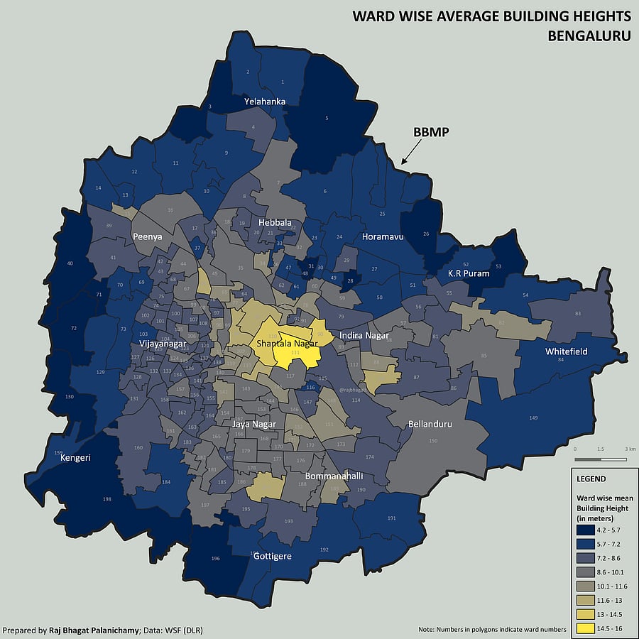
Geoanalytics expert Raj Bhagat visualised ward-wise average building height in Bengaluru. This was in response to the Day 13 prompt ‘Choropleth’, which refers to a thematic map that uses colours and shades to depict data. He chose a palette of yellows, greys and blues. A yellow patch in the centre of the map rendered the tallest buildings, standing at an average of 145 metres and located in Shantala Nagar.
Not easy
Many are known to give up the challenge mid-way. GIS analyst Janhavi Mane gave in after making five maps. This was her second attempt at the challenge. It’s Thiyaku’s third stint. This time, he quit on Day 16 as he fell sick. Raj has been participating since the first edition but has finished the challenge only once. Till Tuesday, he had put out 14 maps for this edition.
They all have a day job and finding time to make a map daily is often not possible. “In Inktober, you draw things from your imagination. Mapmaking is also an art but it is rooted in existing data. We need to look for specific data from a reliable source and it should also be legible. Sourcing data for India is relatively difficult,” Janhavi said.
Creative corner
The 30 Day Map Challenge is an extension of the jobs the map creators already do but it also gives them room to express unconventional ideas.
For the prompt ‘Analog’, Janhavi drew a map of her school and the neighbourhood around it by hand. Raj created a map on potato consumption during the reign of emperor Akbar, and another to depict an imaginary straight line between Kanyakumari in India and Los Angeles in the US, running over the sea and not intercepted by land. Jyoti had fun putting together a GIF map on the Fire Weather Index of Australia and another on the fine particulate matter in the Indian air.